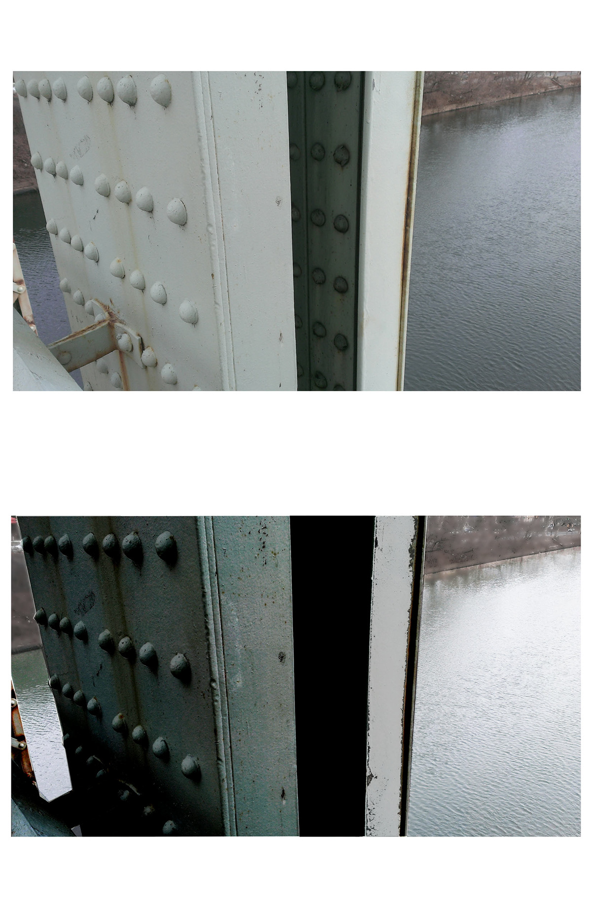
Documentation I
A

My drawings for documentation are a bit too light. I typically sketch light, but have been trying to add more punch to my drawings right away with darker darks.
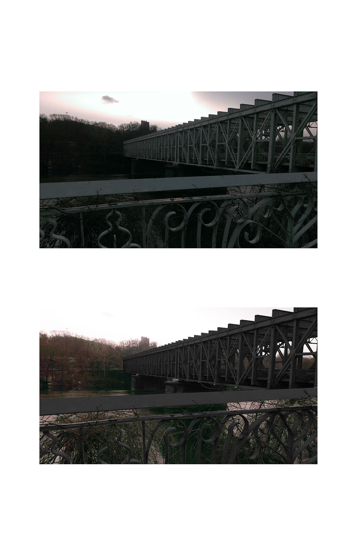
B

The images were taken at sunrise. I tried to highlight the bracing of the bridge in each image, but they do feel disconnected. I wish I had zeroed in on more details and small moments instead of trying to capture big things.
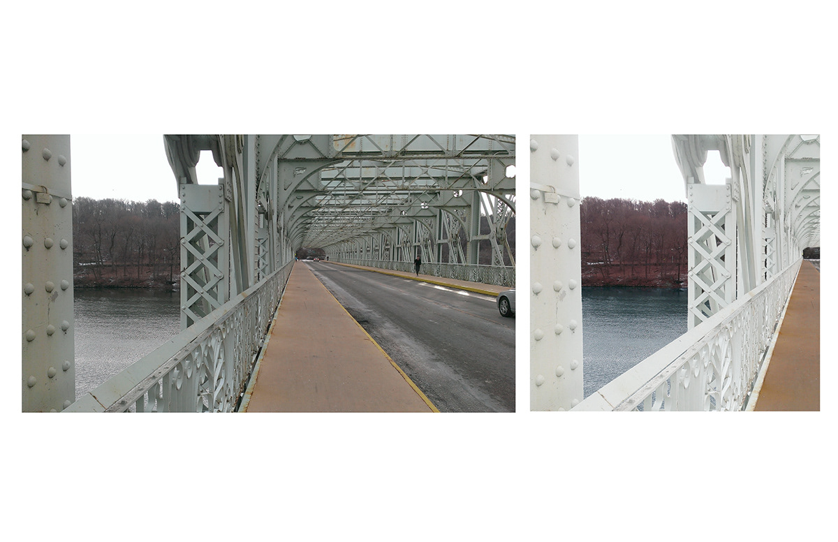
C

I tried to make the collage into a curved shape and capture more of the road seen in the direct cone of vision. The image came out too big and broken. The pictures used to achieve my desired effect were not effective in doing so.
Manipulation I
A

Manipulation was another disappointment. I feel like my ideas weren't cohesive enough so they didn't end up as effective pieces. This one here feels minimalistic although I tried to alter the light on the ground from the tinted blue that it originally was.
B

This image is just dark. I tried to play with light by it went wrong and became illegible.
C

Here I tried to take the blue tint in my original image and take it further to bring the bridge forward and really make it stand out. All the blue doesn't work for me and some areas are too dark where I tried to boost the contrast.
D
This is another case where I feel there isn’t enough. The idea isn't clear. I don't even remember what I was trying to convey.
Collage

Collage just went wrong. I wanted to make the foreground of the bridge pop with the hand drawing. However, the hatching technique that I used makes the drawing too dark and smudged in Photoshop. The scanner just made it worse and gave me a bad image to start with.
Texture

VIlla Stein is a building of white plaster so I decided that my language should reflect natural elements. This goes from the wood of the floor to the shadows of the scale figures. I wasted the drawing to read as soft and delicate while still making the lines pop. I unfortunately lightened the grid lines a bit too much. In the top especially, I feel that being too light makes them feel out of place.
Representation I

Representation was an exciting exercise. Much of the attention was focused on the drafting and getting it as clean and precise as possible. The format is intended to give the piece a feel of reveal, showing more of the controller as the eye travels upward. The plan was in the centre and almost adds a pleasant symmetry to the piece.
Representation II

The second iteration of Representation was quite exciting as well. The drafting was simple, considering the controller is, for the most part, symmetrical and the original drawing is easy to read and duplicate. The format is what changed most here. However, the eye is still supposed to travel upward to see more of the controller exposed.
Free Swim
A

Free Swim is a second chance at project 2. I was much more deliberate in my alterations of photos this go around, hopefully yielding a much stronger submission. The first image manifested itself from cleanliness and bare nature. The major change is the removal of all branches in the foreground. The intention was to make the bring pop in its environment.
B
The next image is from the previous submission. The point of this was to play with light while having a pretty dark starting point. I believe this is more successful and actually legible.
C

The next submission is also from the previous submission. I believe the fault there was the lack of any purpose. My intent was not clear. Here is think it is clear that I wanted to alter the reading by adjusting what read as shadow and what was exposed to light.
D
The final image also follows the avenue of a pristine bridge. However, after fooling around with the image I discovered the presence of primary colors and tried to bring them out and highlight them above the bridge while keeping the image from becoming overwhelming.
Documentation_II
A

The purpose of this assignment was to study the Barnes Foundation Museum, I did so by focusing on the city and how the building interacts with its environment;.
B

This is my study furthered through photography. Each shot was taken with the goal of heavily incorporating the building's environment.
C

Here I chose to remove what was in the photograph. In Illustrator, I recreated what was present to help establish my focus.
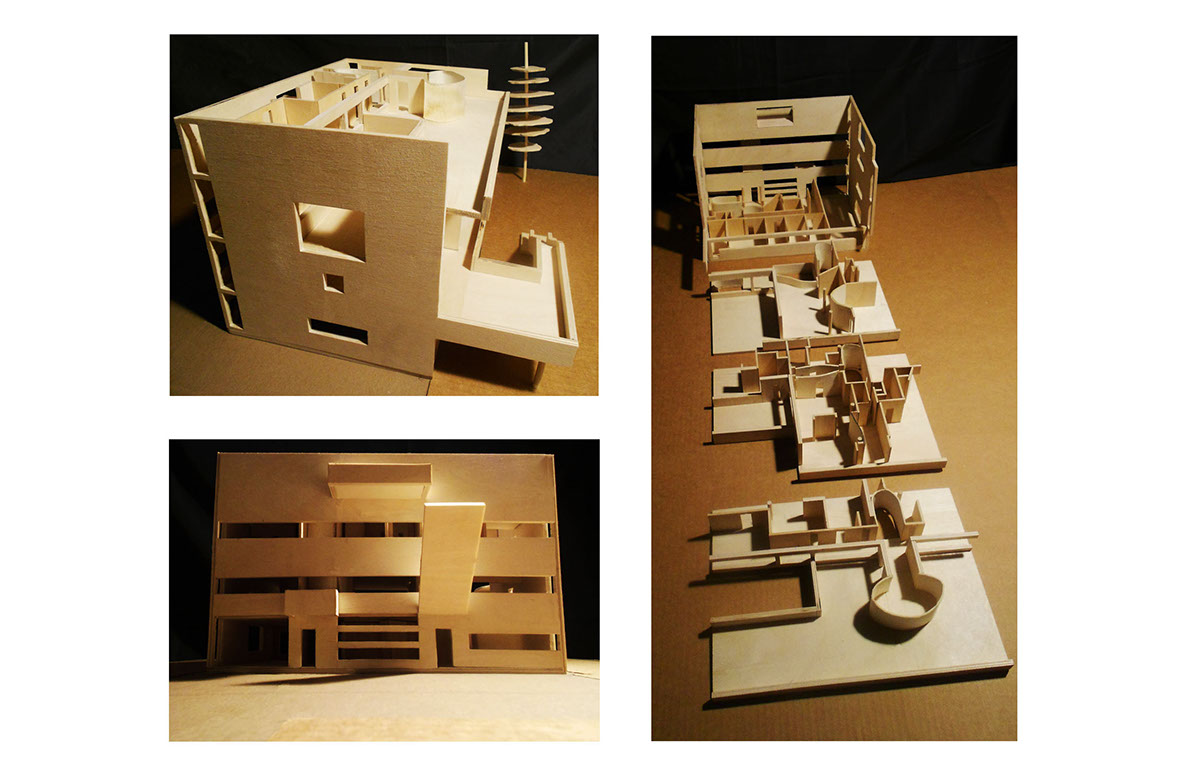
Constructs_I
A

This is a photograph with hand-drawing placed over it. The intention was to draw attention to pieces of the house that seemed to protrude from the structure. The drawn sections were then given a texture similar to the house.
B

Villa Stein is placed on a very long and flat site. The image here has the model added to the site and emphasizes the property line.
C

This began as an image taken through the model and became a perspective section of the house's second floor.
Constructs_II
A

B
This project required taking photographs of a model and enhancing it with photoshop. The image above is each of the before shots.
Narrative_II

With a partner, this building of the Cooper Union was studied. Together we created a competition board with relevant information that helped the idea we wanted to convey.
Recover
A

This project called for the redesign of a book cover. I chose the book Good Omens. The idea is to portray the angel and demon as they lounge. This is to illustrate their relationship right away as well as their purpose to find the anti-christ.
B

The redesigned cover is place over the book and photographed.
Graphic

During this project I studied the Cooper Union again. Here I had to create a possible lecture poster using the school's style and relevant architects.
Perspective
A

This is a perspective section of my final studio project. I wanted to focus on the length of the piece and the different lighting situations of each level. This is why I took the section through the middle of the building.
B

This is an interior perspectinve of the same model but for a different purpose. The area this is taken from is meant to be dark and small to emphasize the transition into the open library.
